Charts in BIRT – A Simple Chart Example
In this tutorial, we will create a BIRT report with a simple Bar chart showing the monthly sales in 3 different states of the US. We will be using the same food mart database in MySQL for a datasource. So, we are going to have 3 fields, the Month (on category axis), the States (Series) and the Total Sales (on the Value axis).
Make data easy with Helical Insight.
Helical Insight is the world’s best open source business intelligence tool.
(Note: As in the previous tutorials, we are using the Eclipse based BIRT report designer to develop this report)
Let’s begin –
Define the Data Set
As we have seen in previous tutorials, first step would be to create a data source and then define a data set which will pull the data for my chart. Below is the data set we need –
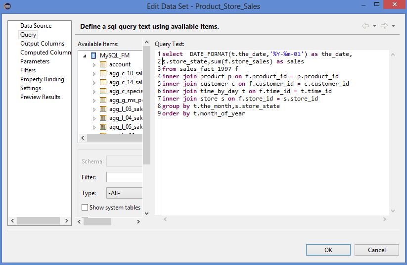
There is a particular reason why I chose to select “first date of the month” as a column instead of the month column, though the grouping is by month column. This is to ensure that my category axis could be a date/time axis and would plot my months in the correct order.
As we are not using any parameters for our report, we have nothing more to specify.
Adding the Chart component
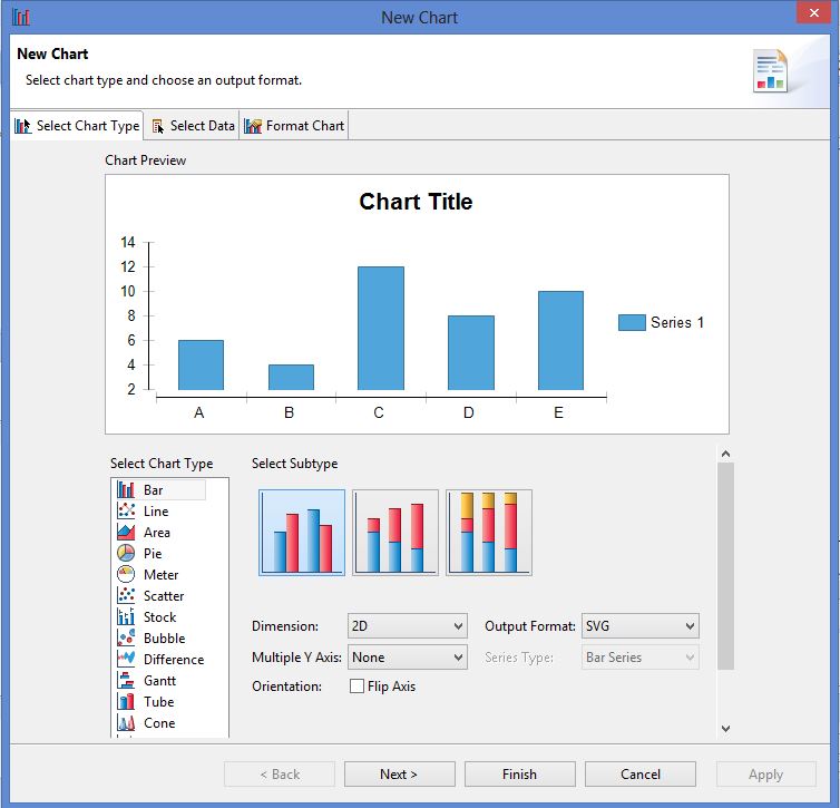
Drag and drop the “Chart” component from the palette onto the report. The Chart Editor will automatically pop up.
There are 3 tabs, the first one is to select the “Chart Type”. In this case we select the Bar Chart, the first one which a Grouped Bar Chart.
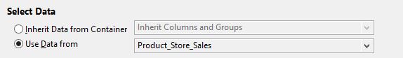
Then, we click on Next to go to the next tab, to select the data for the chart. This involves selecting the source of the data and then binding the columns to the chart.
We select the data set that we defined
And then we bind the columns to the chart i.e. we select what columns to bind with the category, value and series axes.
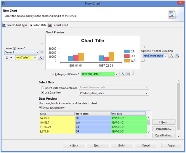
As seen above, we selected the “the_date” to be used as category, “store_state” to be used as a series and “sales” as a value.
In the Next tab, we can format the chart, the different aspects of it, the axis, the title, legend, tooltips, colors, font, back ground and so on.
Make data easy with Helical Insight.
Helical Insight is the world’s best open source business intelligence tool.
We will first click on “X-Axis” in the Left hand side of the panel, to change our Category Axis Type.
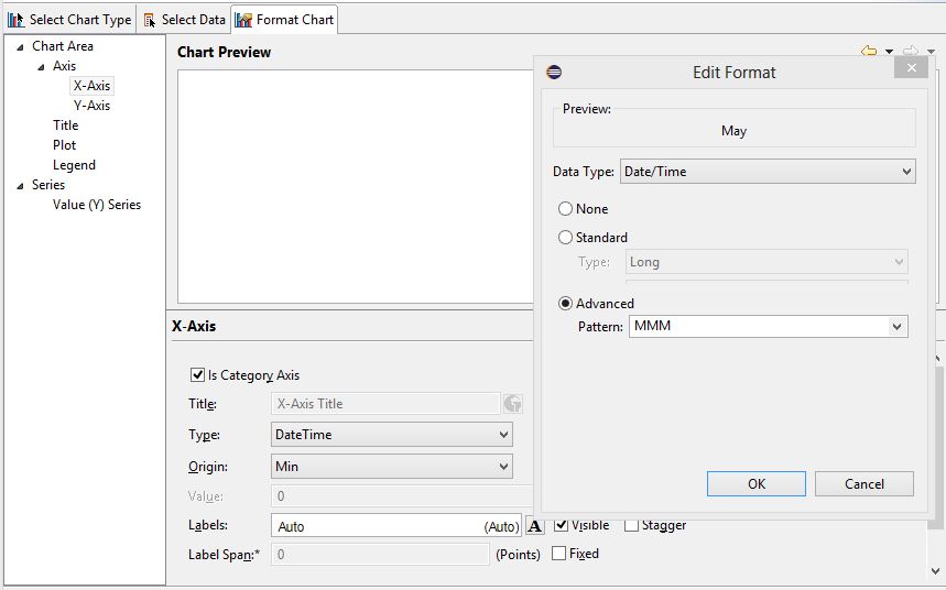
Firstly, change the Type to “DateTime” and then click on the “Format” button right next to it. Set the format to Month (MMM) using “Pattern” option under “Advanced”. Though “MMM” is not listed in the drop down menu, it is a valid format.
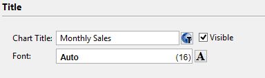
Then we will go and add a Title to the chart
There is a lot more formatting that we can do, but for now, we will go ahead and click on “Finish”.
Make data easy with Helical Insight.
Helical Insight is the world’s best open source business intelligence tool.
Save the report and Preview.
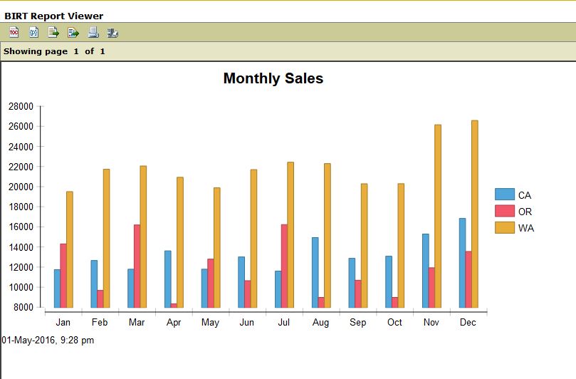
There you go, we have our Monthly sales chart ready.
More on the charts to follow in upcoming posts, so stay tuned!

Best Open Source Business Intelligence Software Helical Insight is Here
A Business Intelligence Framework
Shraddha Tambe | Helical IT Solutions
Bar chart in BIRT BIRT BIRT Charts BIRT Introduction Charts in BIRT - A Simple Chart Example Date time axis in BIRT Design a BIRT Report Chart In BIRT is it possible to create a chart from summarized data simple birt report Using The BIRT Chart Engine in Your Plug-in What are the simplest types of charts BIRT