Creating Simple charts with C3.js
This Blog aims to explain how to use a library called C3 for building simple charts. C3 is a javascript library which builds on top of famous D3.
C3 makes it easy to generate D3-based charts by wrapping the code required to construct the entire chart. We don’t need to write D3 code any more.
Make data easy with Helical Insight.
Helical Insight is the world’s best open source business intelligence tool.
C3 gives some classes to each element when generating, so you can define a custom style by the class and it’s possible to extend the structure directly by D3.
Getting started with c3.js
1. Setup
Download the latest version here:
• https://github.com/masayuki0812/c3/releases/latest
Then, load the scripts and css:
<!-- Load c3.css -->
<link href="/path/to/c3.css" rel="stylesheet" type="text/css">
<!-- Load d3.js and c3.js -->
<script src="/path/to/d3.v3.min.js" charset="utf-8"></script>
<script src="/path/to/c3.min.js"></script>
C3 depends on D3, so please load D3 too.
2. Generate Chart
C3 generates a chart by calling generate() with the argument object, and a element including the chart will insert into the element specified as a selector in that argument as bindto.
Prepare the element to bind the chart:
<div id="chart"></div>And, call generate() with arguments:
var chart = c3.generate({
    bindto: '#chart',
    data: {
      columns: [
        ['data1', 30, 200, 100, 400, 150, 250],
        ['data2', 50, 20, 10, 40, 15, 25]
      ]
    }
});
C3 supports the asynchronous module definition (AMD) API. If you use RequireJS, you can load like this:
require.config({
  baseUrl: '/js',
  paths: {
    d3: "http://d3js.org/d3.v3.min"
  }
});

require(["d3", "c3"], function(d3, c3) {
  c3.generate({
    ...
  });
});
Then, you will see the chart:
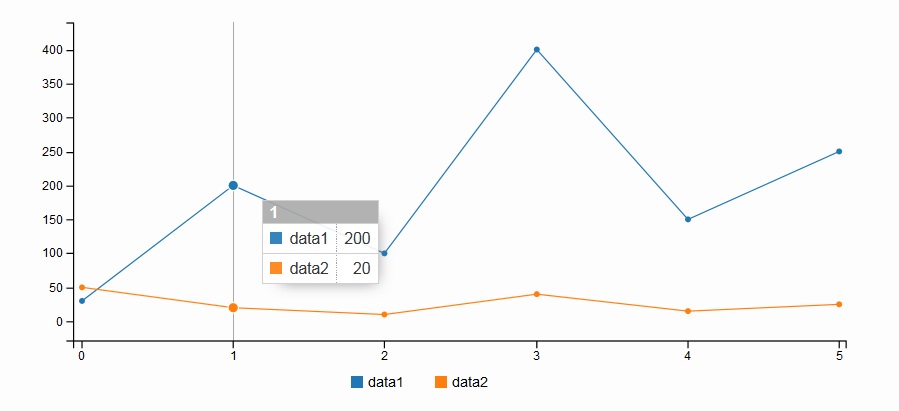
Data can be loaded as columned data / rowed data / csv in URL/Json data.
There are serveral options to customize the chart and you can see those here:
• Examples
3. Customize Chart
The chart can be customize by giving some options when generating. We will introduce some of them here.
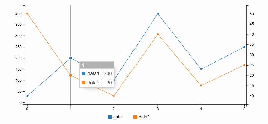
1. Additional Axis
Introduce additional axis for data2. Add data.axes and axis.y2.show as follows:
var chart = c3.generate({
    bindto: '#chart',
    data: {
      columns: [
        ['data1', 30, 200, 100, 400, 150, 250],
        ['data2', 50, 20, 10, 40, 15, 25]
      ],
      axes: {
        data2: 'y2' // ADD
      }
    },
    axis: {
      y2: {
        show: true // ADD
      }
    }
});
Then, the chart will be like this:
2. Show Axis Label
Show labels for each axis. Add axis.y.label and axis.y2.label as follows:
var chart = c3.generate({
    bindto: '#chart',
    data: {
      columns: [
        ['data1', 30, 200, 100, 400, 150, 250],
        ['data2', 50, 20, 10, 40, 15, 25]
      ],
      axes: {
        data2: 'y2'
      }
    },
    axis: {
      y: {
        label: { // ADD
          text: 'Y Label',
          position: 'outer-middle'
        }
      },
      y2: {
        show: true,
        label: { // ADD
          text: 'Y2 Label',
          position: 'outer-middle'
        }
      }
    }
});
Then, the chart will be like this:
Make data easy with Helical Insight.
Helical Insight is the world’s best open source business intelligence tool.

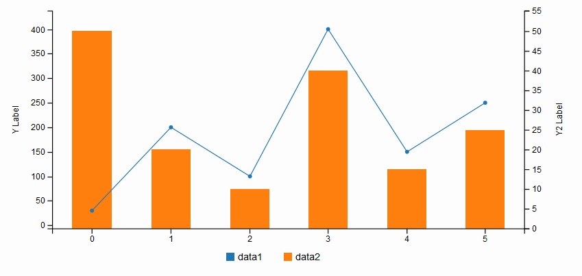
3. Change Chart Type
Show data2 as Bar chart. Add data.types as follows:
var chart = c3.generate({
    bindto: '#chart',
    data: {
      columns: [
        ['data1', 30, 200, 100, 400, 150, 250],
        ['data2', 50, 20, 10, 40, 15, 25]
      ],
      axes: {
        data2: 'y2'
      },
      types: {
        data2: 'bar' // ADD
      }
    },
    axis: {
      y: {
        label: {
          text: 'Y Label',
          position: 'outer-middle'
        }
      },
      y2: {
        show: true,
        label: {
          text: 'Y2 Label',
          position: 'outer-middle'
        }
      }
    }
});
Then, the chart will be like this:
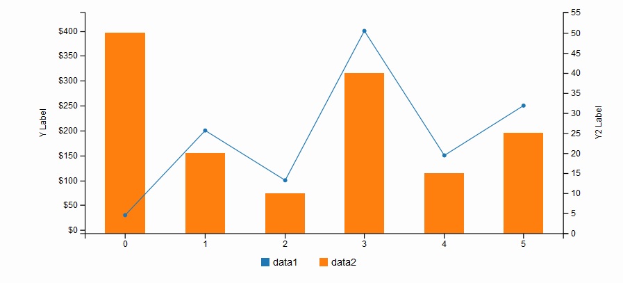
4. Format values
Format the values of each data. Add axis.y.tick.format as follows:
var chart = c3.generate({
    bindto: '#chart',
    data: {
      columns: [
        ['data1', 30, 200, 100, 400, 150, 250],
        ['data2', 50, 20, 10, 40, 15, 25]
      ],
      axes: {
        data2: 'y2'
      },
      types: {
        data2: 'bar'
      }
    },
    axis: {
      y: {
        label: {
          text: 'Y Label',
          position: 'outer-middle'
        },
        tick: {
          format: d3.format("$,") // ADD
        }
      },
      y2: {
        show: true,
        label: {
          text: 'Y2 Label',
          position: 'outer-middle'
        }
      }
    }
});
Then, the chart will be like this:
More information about the options, please see Examples.
4. Customize Style
C3 give some classes for each element when generating. So, you can change the style of the elements by using those classes.
1. Line style
The lines have c3-line-[id] class, so this class can be used to define the style in css as follows:
#chart .c3-line-data2 {
  stroke-width: 5px;
}
Then, the chart will be like this:

Check Demo of this c3.js library
For more information check examples or fork on Github.
-By
Nitin Uttarwar
Helical It Solution

Best Open Source Business Intelligence Software Helical Insight is Here