How Bootstarp grid works
Twitter bootstrap is one of the most well-known frontend framework out there on the web. It is very easy to get started with and can greatly speed up one’s workflow. It’s a great tool to quickly create a mock-ups. Although many websites use bootstrap in production, I will not recommend using it directly in production for two reasons. First is semantics and the other is bloat. But that is a whole other topic for discussion.
For now let’s just focus on the topic we have on our hands right now. I’ve been perplexed at times by the grid system and how it works? There might be other people out there who face similar problems. So here I try to explain how it works.
The Grid
The grid consists of mainly three components, namely: container, row and columns. Lets have a look at them individually.
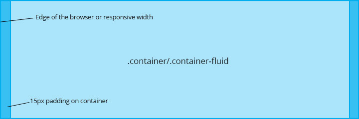
Container
The container is the foundation of the grid. It serves 2 purposes:
- To provide width constraint on resonpsive widths
- To provide padding to the content (shown in blue), so that they do not stick to the edge of the browser.
There are two types of containers available in bootstrap:
- Fluid Container: As the name suggests, it always spans the entire width of the browser. It can used by using
.container-fluidclass on a element. - Responsive Container: It provides a width constraint to content depending on the width of the browser. It can used by using
.containerclass on a element.
| breakpoint | container width |
|---|---|
| <768px | None (auto) |
| ≥768px | 750px |
| ≥992px | 970px |
| ≥1200px | 1170px |
Please avoid wrapping a .container within another .container or a .container-fluid within another .container-fluid
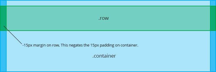
Row
A row serves as a wrapper for columns. The columns must add upto 12 within a row. It also clears the float of the columns. A row has a negative margin of 15px on both sides (shown in green) which negates the 15px padding provided by the container. This is necessary for columns to work correctly as we’ll see later.
Do not use .row oustide .container or .container-fluid
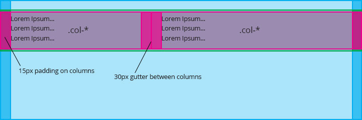
Columns
A row must have columns that add up to 12. A column has a 15px padding (shown in pink), which touches the edge of the container (due to negative margin on row), thus behaves similar to a container. The padding also acts as a gutter (of 30px) between columns
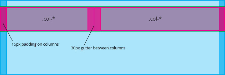
Do not use .col-* oustide .row
The 15px padding (shown in pink) of a column, doesn’t allow the content to touch the edge of the browser and also acts as separator between columns
| Extra small devices Phones (< 768px) |
Small devices Tablets (≥ 768px) |
Medium devices Desktops (≥ 992px) |
Large devices Desktops (≥ 1200px) |
|
|---|---|---|---|---|
| Grid behavior | Horizontal at all times | Collapsed to start, horizontal above breakpoints | ||
| Container width | None (auto) | 750px | 970px | 1170px |
| Class prefix | .col-xs- |
.col-sm- |
.col-md- |
.col-lg- |
Detailed usage of columns can be found here
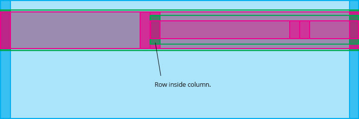
Nesting
After setting up container(blue), rows(outer green) and columns(outer pink), new grids can be created using rows(inner green) straight away (you don’t need containers) because of the fact that columns behave the same way as the containers, providing 15px of padding to rows, which in turn negate them via their negative 15px margins.
In next post, I’ll continue this discussion with offsets, push and pull.

Best Open Source Business Intelligence Software Helical Insight is Here