How Bootstarp grid works (continued)
In the last article, we had a look at the container, rows, columns and nesting. Now we are going to cover offset, push and pull.
Offset
Usually the columns come one after the other, but what if we want to provide some extra space between or center a ten column grid. The first thing that comes to mind is to create an “empty” div with required witdh/columns. But this leads to unnecessary mark in our HTML. This where offsets come into picture. You can skip certain number of columns using col-*-offset-*. Offset works by setting margin-left property on the column.

Push and Pull
Push and pull are used for ordering the columns regardless of the markup. Let us assume that you have the following code.
<div class="row">
    <div class="col-md-9">.col-md-9</div>
    <div class="col-md-3">.col-md-3</div>
</div>
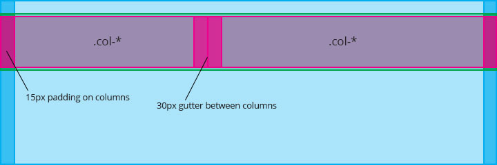
Normally, the bigger div will come first and the smaller one will come next, as shown below:

Now, if we want to interchange the div(s) but without change the markup, we can use the col-*-push-* and col-*-pull-* classes. And we’ll have something as shown below:
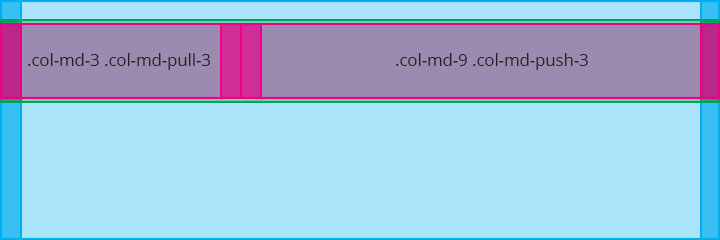
As the name suggests, push – pushes the columns to right by setting margin-left property on the column and pull – pulls the columns to left by setting margin-right property on the column.
Wrap up
I hope this gives you a better understanding of the bootstrap grid and its inner mechanism

Best Open Source Business Intelligence Software Helical Insight is Here