There are many broad categories of chart, this blog will highlight chart and it’s usage. This article will help a user to understand when what type of chart is to be used
a. Area Chart : Area chart should be used when we want to emphasize the magnitude of change over time. Area chart will show how much the value of a variable has changed over a period of time.

b. Stacked Area Chart : Stacked area chart also emphasizes the magnitude of change over time, while comparing values over multiple categories.

c. Horizontal Bar Chart: Bar chart is to be used when easy and fast comparison is required across multiple categories. This kind of chart gives less emphasis to time but more emphasis to comparison of values.

d. Stacked Horizontal Bar Chart: Grouping occurs here. This is more commonly used when when part to whole comparison is required.

There are many further variants to the above mentioned charts like 3D bar charts, cyclinder bar charts etc.

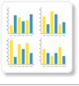
e. Vertical Column Chart: This is also quite similar to horizontal bar chart, its just that values are plotted vertically. Again, this kind of chart is used when we want to have a faster comparison and less focus is there on time.

f. Stacked Vertical Bar Chart: Grouping occurs. More commonly used when part to whole comparison is required.

g. Layered Chart: This chart is used when we want to compare the contribution of an entity to the total across categories is required.

h. Combination Chart: Here we superimpose one chart above or below another chart. This is done to improve clarity and highlight relationship between them.

i. Overlay Chart: Again, superimposing of one chart on top of another done here. Ofter line and bar charts are used for it. Line chart shows the trend and bar chart emphasizes the individual values.

j. High Low Chart: This chart shows daily high values, low values, opening and closing values are shown by tick position on the chart itself.

k. Candlestick Chart: Again similar to high values, low values, opening and closing values. Different color bars can also be used depending on the direction.

l. Line Chart: Used for viewing trends over time by plotting data connected over time and connecting them by lines. Line chart to be used when plotting many metrics.

m. 3D Line Chart: Similar to line chart, just that the lines are 3D in nature.

n. Z Chart: Trends shown over a short period of time; displaying the total, accumulative total and moving total.

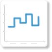
o. Stepped Line: Similar to line chart, but movement is shown in steps rather than lines.
p. Meter: Generally more commonly used in dashboard. Rate of change of measure against pre-defined targets.

q. Thermometer: Vertical representation of meter chart, indicating a range of qualitative indicators.

r. Dial Chart: Used to indicate key performance indicators.

s. Numeric Display: Used to show values in numeric format.

t. Pie Chart: Used to show relationship of part to whole or the percentage contribution. If actual values are to be highlighted, pie chart should not be used.

u. Various formats of pie chart present like 3D pie charts, multiple pie chart and donut chart (pie chart in circular ring format).
w. Histogram Chart: It shows number of times a given values occur in a dataset.

x. Bubble Chart: Bubble chart with different size of bubble, at different location can be used very effectively to describe 3D data in a 2D chart. Further the color gradient of bubble can be yet another variable.

y. Scatter Chart: Used to often represent points which are not joined, and thus trying to deduce a trend out of the same.

z. Trellis Chart: A segmented chart for which behavior is determined by the data selected.
aa. Waterfall Chart: It’s a special type of floating column chart. A typical waterfall chart shows how an initial value is increased and decreased by an intermediate values, leading to final value.

ab. Funnel Chart: Used to show the status of stages in a process.

ac. Radar Chart: Comparing values across multiple axes.

For any data visualization, please get in touch with us
Nikhilesh : nikhilesh@helicaltech.com

Best Open Source Business Intelligence Software Helical Insight is Here