PARETO CHART
What is Pareto Chart? Pareto chart is a data visualization tool which contains both bars & line graphs. In this, individual values are represented in decreasing order by bars & the cumulative total is represented by the line. Its named after Vilfred Pareto, an Italian economist and sociologist who conducted a study in Europe in the early 1900s on wealth and poverty. He found that wealth was concentrated in the hands of the few and poverty in the hands of the many. The principle is based on the unequal distribution of things in the universe.
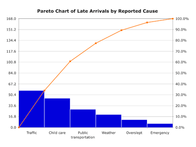
Pareto Chart Example
When to use : Whenever we are having a number of factors, then pareto chart is used to highlight the relative importance (since the bar graphs are also arranged in decreasing order).
See the typical use cases highlighted below
– Used in customer care to show the most coomon customer dis-satisfaction factors
– Can be used in quality control to show common source of defects
The Pareto chart is generally used to you focus your improvement efforts on those issues that: 1.) Cost the most or 2.) Pose the highest risk / liability or 3.) those areas that occur the most often.
Dos & Donts :
If used properly, pareto chart can help a lot in understanding the key factors. The below mentioned factors are to be kept in mind & if used in conjuction, can provide a lot of actionable insight
a. Sub division :- It means, lets say at a customer care post using pareto they have found out that from a specific location maximum complaints are coming. Now, ideally they should further design a pareto for that specific location to get more insights (like in some cases there might be some complaints from a specific part of location because of some miscellaneous factor etc)
b. Multi-perspective analysis :- We should also do a multi-perspective analysis for ideal insights. For examples – if we take above case, not only they should do an analysis location wise but also reason wise & service wise etc. This might give them specific reasons for specific locations & hence counter measure can be taken to sort out the matter.
c. Repeast Analysis :- This depends on case to case or industry to industry basis, but based on their true knowledge & how they think the data dynamics are changing, the pareto charts should be updated & redesigned.
This is generally know as first level pareto analysis, second level pareto analysis (this is pareto analysis of the first bar of first pareto analysis) & third level pareto analysis (this is pareto analysis of the first bar of second pareto analysis)
Industry specific examples of Pareto Chart Usage :-
Below mentioned are some of the real world example usages of Pareto chart usage in industries & business organizations for data visualizations & analysis
- Marketing – Where are the majority of my advertising dollars going? Which channels produce the most sales leads?
- Healthcare – What types of infections are the most prevalent? What procedures are associated with the majority of return hospital visits?
- Sales – Does a small percentage of customers account for a large percentage of revenue? If so, which ones?
- Customer Service – How can I improve customer satisfaction? What do customers complain about the most?
- Manufacturing – What defect types are most prevalent & key to improving an inspection process etc

Best Open Source Business Intelligence Software Helical Insight is Here