In this blog the following topics will be covered :
- Changing series colors in Jfree charts
- Changing measure range and displaying percentile symbol with measure value on the y-axis
Prerequisites: Jasper Studio 6.4.0
Database Name: foodmart
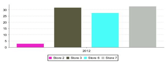
1. Whenever we create a chart some colors are applied by default.
See below image: Store sales Profile/Loss Percentage Bar chart

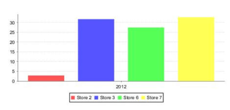
Follow the steps to change series colors in the chart:
If we click on the chart, in chart properties > chart plot > Series Colors > Add
choose colors based on your requirement. Click on finish to apply those colors.
In below image: Adding series colors

Below Image: Bar chart with changed colors
2. Changing measure range and displaying percentile symbol with measure value on the y-axis
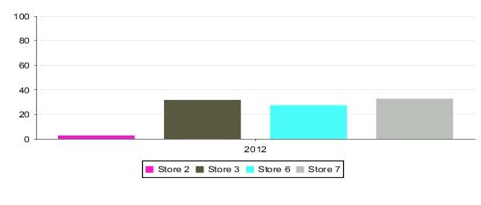
Below image: Bar chart with default range on the y-axis
If we click on chart Properties > Chart > Chart Customizers

Choose Value Axis Range and Tick, then click on next you will get

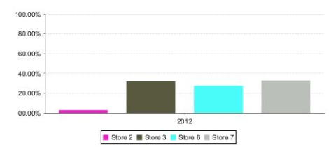
Enter Min Range, Max Range and Distance values, click on finish to apply given ranges.
To give percentile symbol to the range :
Click on chart properties > Chart plot
![]()

Best Open Source Business Intelligence Software Helical Insight is Here
A Business Intelligence Framework
If you have any queries please get us at support@helicaltech.com
Thank You,
Anjaneyulu
charts jasper server jasper studio jaspersoft jaspersoft studio jfree Jfree charts