Data is of no importance until & unless we are able to extract some information from it. Effective data visualization is very important for the decision-making process. This helps decision makers to examine data, see trends, take actions.
The key to success in using data visualization is ensuring that: the best and most appropriate types of visualizations are used; for different kind of data with different number of variables inn it, different data visualization comes into picture & it only can be the best fit for visualization of such kind of data With a good set of visuals that keep these key success factors in mind, decisions can be made more quickly and with more confidence so that your business can continue to grow.
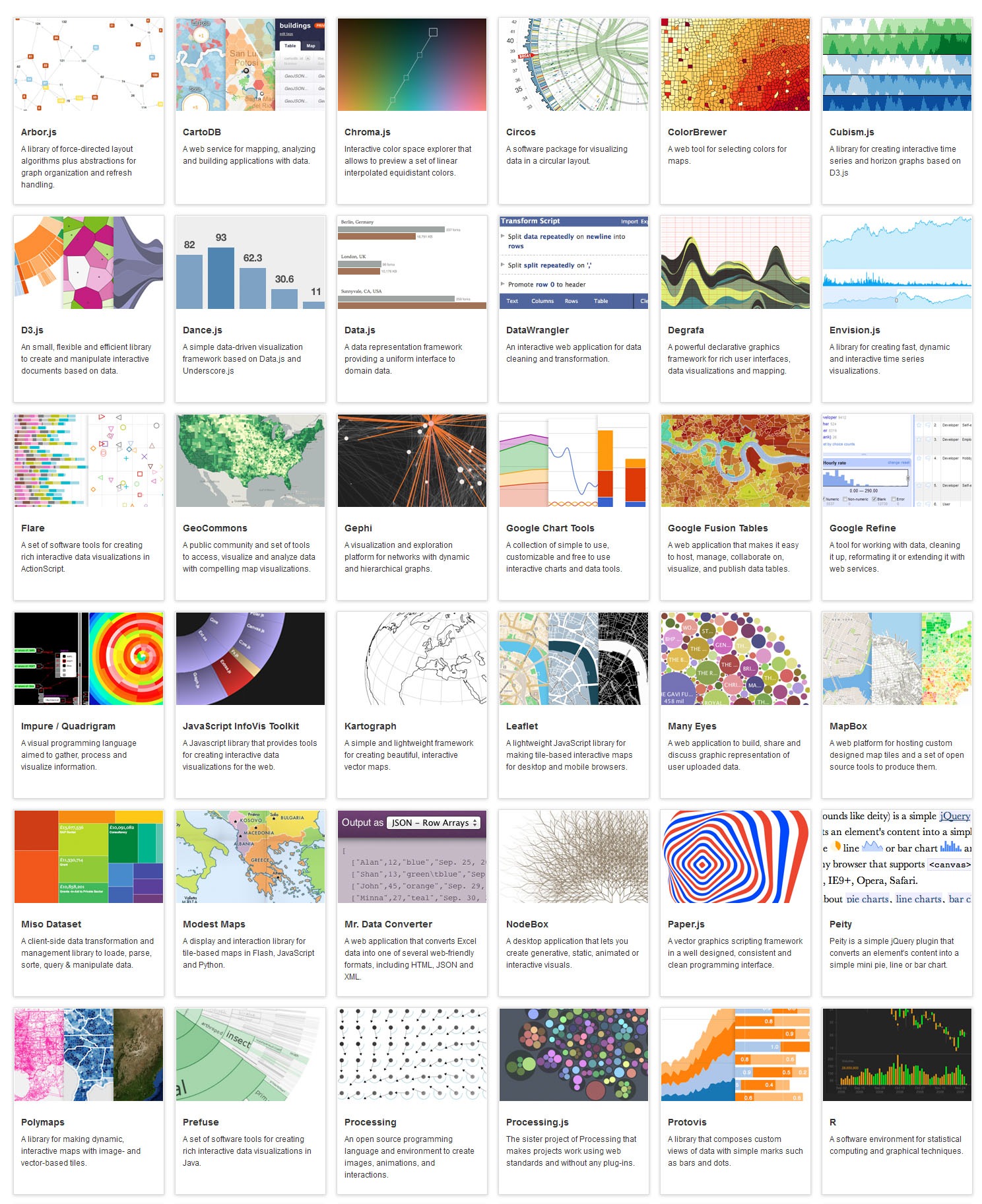
There are myriad number of tools available in the market. This blog will help you in understanding, when to use, what to use, how to use. We would be your one stop solution & will provide you invaluable advice for your data visualization techniques.
Every week, we would be adding 2-3 in-depth analysis of different charts & graphs.
REMEMBER – DATA VISUALIZATION IS NOT A SCIENCE BUT AN ART TO BE PERFECTED
a. Basic Charts (pie, graphs, bar etc)
b. Status Indicators (gauges, traffic lights, symbols)
c. Advanced Data Visualization tools (heat charts, spark line, scatter chart, sparkle graphs, tree maps etc)
We would dissect each & every data visualization method existing, one step at a time.
High-End Data Visualization

Best Open Source Business Intelligence Software Helical Insight is Here