When we create ad hoc reports in the jasper server we often opt for default design here we are going to show you how you can make ad hoc chart more presentable.
- Click on the create and choose the option ad hoc view, select the data source and then select the fields you want to show in the report.
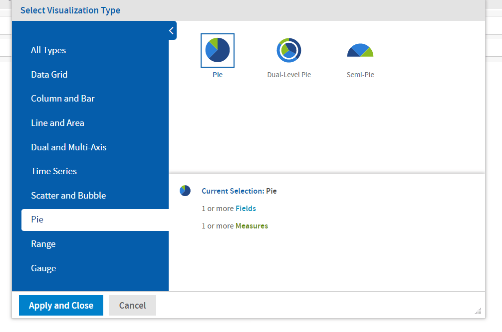
- From the Visualization select the pie chart.
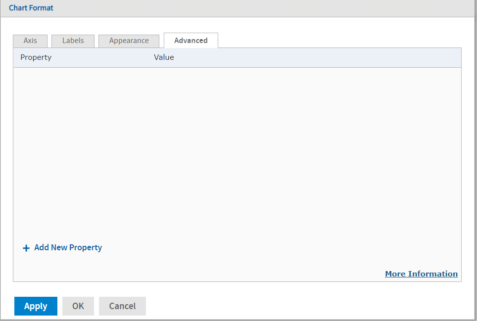
- Now click on chart format and go to advanced tab and then click on add new property.
- Now you can add this properties for pie charts to make it more presentable.
| Property | Value |
|---|---|
| series.dataLabels.enabled | True |
| plotOptions.pie.dataLabels.format | {point.percentage:.1f}%, {point.name}: {point.y} |
| legend.labelFormat | Put you column value name |
| plotOptions.pie.dataLabels.style.width | 120 |
| plotOptions.pie.dataLabels.x | 2 |
| plotOptions.pie.dataLabels.style.fontSize | 7px |
| chart.marginTop | 32 |
| title.style.fontSize | 15px |
| title.text | Put your title text value |
| plotOptions.series.dataLabels.y | -1 |
| title.style.fontWeight | Bold |
| plotOptions.pie.dataLabels.distance | 10 |
Thank You,
Abhishek Mishra

Free Open Source BI Platform

- AI-Powered Analytics
- Embedded Analytics
- Single Sign-On (SSO)
- Multi-Tenancy
- Paginated Canned Reporting
- Interactive Dashboard
- White Labeling
Subscribe
Login
0 Comments
Oldest