Angular gauges are essentially like the speedometer or the fuel gauge of a car.
They use a radial scale to display the data range and a dial to indicate the data value.
Database used:- Foodmart(Mysql)
Query :- “select salary from employee where employee_id = 10”
Step 1:
Create a new Reoprt in iReports and only keep the summary Band in it.
Step 2:
Drag “Widgets Pro” chart into summary band and select Angular gauge from it and
Select “Edit Widget Properties” by right-clicking on the chart.
Step 3:
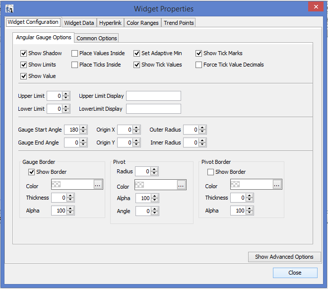
i> In the Widget Configuration > Angular Options > Gauge Start Angle – 180 (shown in Fig.1)
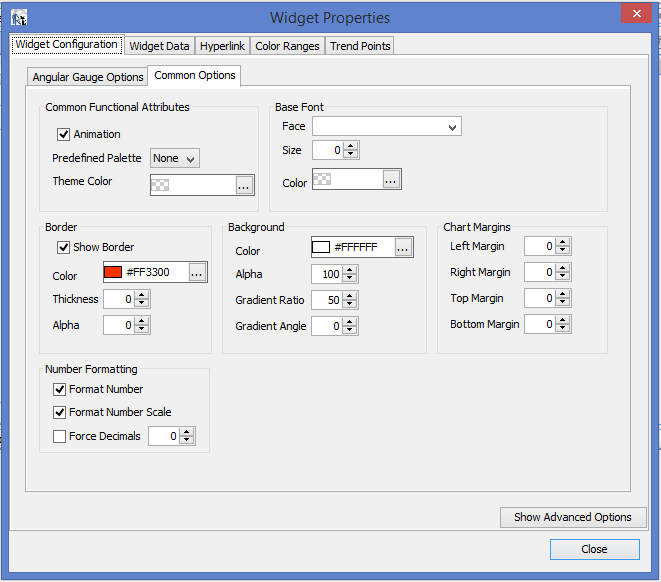
ii> In the Widget Configuration > Common Options >
Tick Mark show border (colour #FF3300)(shown in Fig.2)
Tick Mark Background (colour #FFFFFF)
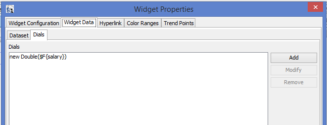
iii> In the Widget Data > new Double($F{salary})
iv> In the Color Ranges > add > Lable Expression(String(“”)),Minimum Value(0),Maximum Value(15000)
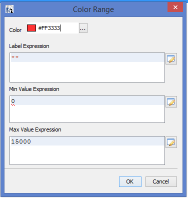
(Do step iv> for adding various colour bands)
v> close
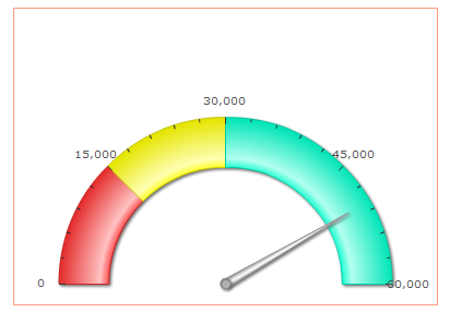
Image after deploying report

Best Open Source Business Intelligence Software Helical Insight is Here
A Business Intelligence Framework
Thank You
Ravi Bhatta
angular gauge iReports jasper server jaspersoft